jallikattu
ART DIRECTION
animation
Project Details
Owner
Vimal
Release Date
20 Aug, 2022
Services
Art Direction, Animation
Duration
30 days
Budget
Overview
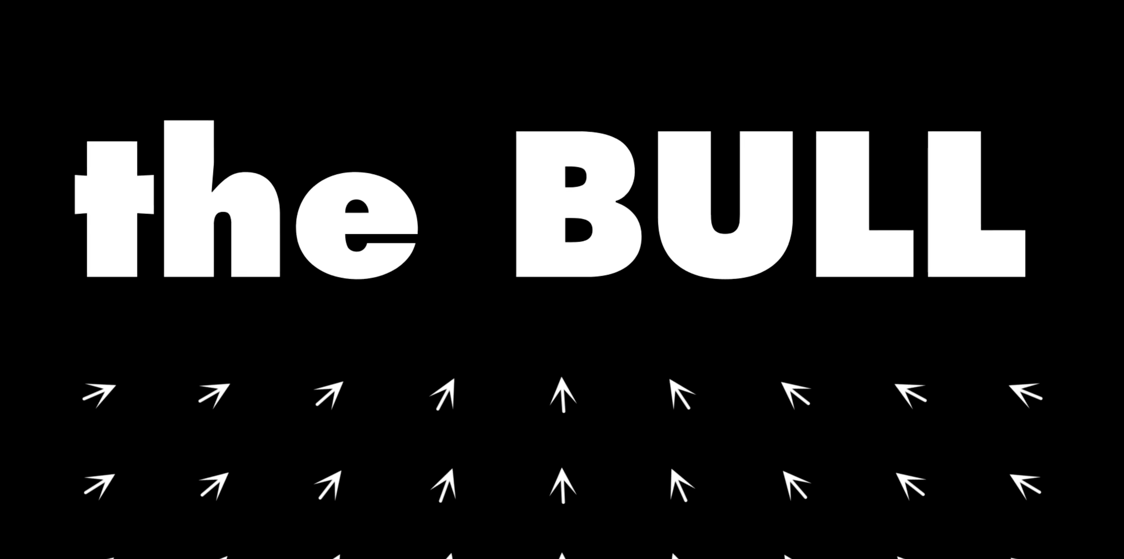
The kinetic typography animation for Jallikattu is a fan-driven tribute to Lijo Jose Pellissery’s thought-provoking film, designed to capture its intense themes of chaos, masculinity, and societal fragility through dynamic text. Using Adobe After Effects, the project employs the Futura typeface for its clean, modern aesthetic, ensuring readability and emotional impact. Text animations, driven by keyframes and animators, reflect the film’s high-energy bull chase and poignant commentary on human insecurities. Synchronized with a hypothetical Hans Zimmer-inspired score, the animation enhances tension and drama. By focusing solely on text, it challenges viewers to engage with Jallikattu’s narrative in a novel format, fostering appreciation among independent cinema fans. Shared online, this project amplifies the film’s cultural resonance, encouraging dialogue about its exploration of civilization’s thin veneer and voyeuristic tendencies.
Objective
The objective of the kinetic typography animation for Jallikattu is to encapsulate the film’s intense emotions and thematic depth through dynamic text movement, using the Futura typeface to reflect its modern, primal aesthetic. The animation aims to convey the chaos, masculinity, and societal commentary central to the narrative without relying on imagery, focusing solely on text to evoke the bull chase’s tension and the fragility of civilization. By leveraging Futura’s clean, geometric design, the animation ensures readability and visual impact, even during rapid motion. The use of varied font weights and styles enhances emotional resonance, mirroring the film’s exploration of human insecurities and societal voyeurism. This project seeks to engage fans of independent cinema by offering a visually compelling representation of Jallikattu’s core themes, fostering a deeper connection to its thought-provoking narrative through innovative typography.
Process
The process of creating the kinetic typography animation in Adobe After Effects begins with scripting text to reflect Jallikattu’s key themes, such as chaos, masculinity, and societal apathy. Using the Futura typeface, text layers are created with varying weights (e.g., Medium, Bold) for visual hierarchy. Keyframes are set to animate properties like position, scale, and opacity, ensuring dynamic movement that mirrors the film’s high-energy bull chase. Animators, such as range selectors, control letter-by-letter or word-by-word motion, enhancing emotional impact. Timing is synchronized with a hypothetical Hans Zimmer-inspired score to amplify tension. The script below automates layer creation and basic animation setup. The animation is refined through previewing and adjusting easing curves for natural motion. The final output is rendered in a high-resolution format suitable for sharing with Jallikattu fans.
Impact
The kinetic typography animation for Jallikattu profoundly impacts its audience by visually interpreting the film’s intense themes through dynamic text, resonating with fans of thought-provoking cinema. The use of Futura’s clean, geometric design ensures clarity and modernity, amplifying the emotional weight of words like “chaos” and “savagery.” The animation’s synchronized motion, paired with a Zimmer-inspired score, heightens tension, mirroring the film’s bull chase and societal commentary. By focusing solely on text, it challenges viewers to engage with Jallikattu’s exploration of masculinity and voyeurism in a novel format, fostering deeper reflection. Shared online, this fan art strengthens the film’s community, encouraging discussions on its themes. The animation’s accessibility and striking visuals make it a powerful tribute, enhancing Jallikattu’s cultural footprint within independent cinema circles.